UI Traps - Sliders
03 Aug 2023Don’t be trapped by the allure of the slider.
What’s a slider?
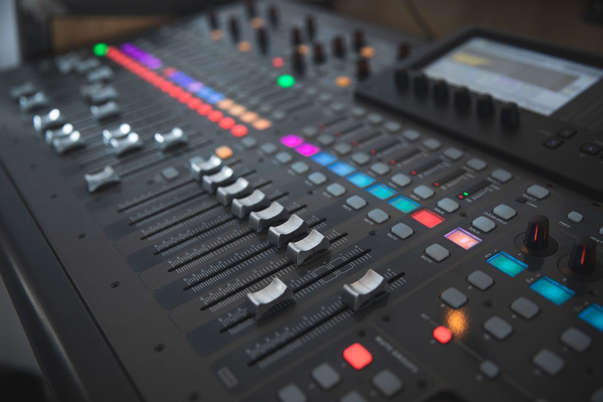
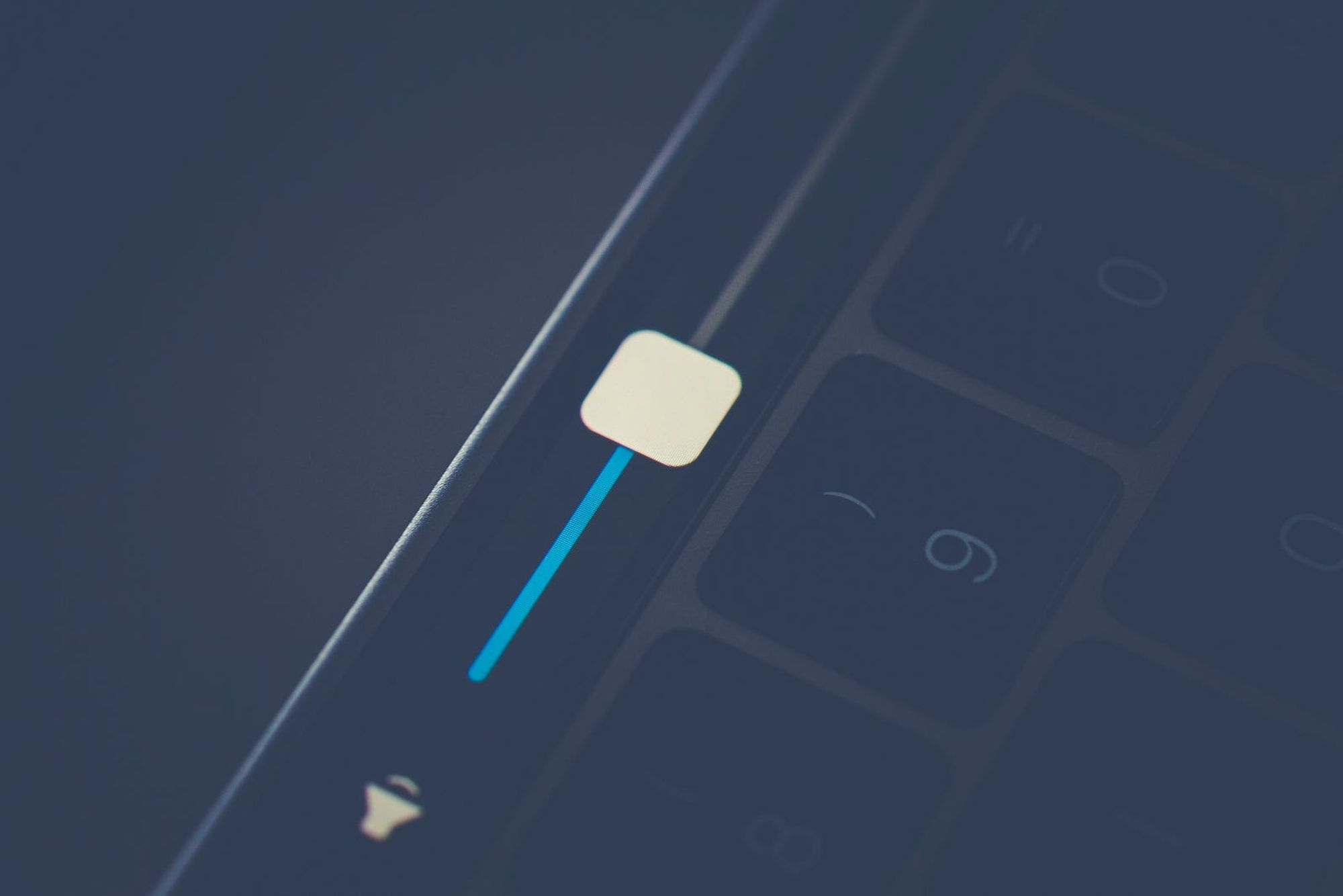
Sliders in UI were inspired by physical hardware controls. Soundboards often include sliders for controlling the volume of each audio channel. The board’s user can make adjustments by moving the slider within a limited range, such as 0 to 100%. Let’s translate this idea to software. Sliders can work in a similar way for digital controls like the one on a MacBook Pro with Touch Bar. Based on the skeuomorphic reference a user can quickly decipher this control is a handle on a track. Moving the handle along the track with a touch gesture will instantly increase or decrease the volume. Simple right? Let’s look closer.
Sliders are imprecise by default
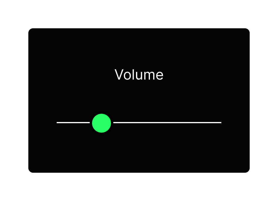
Sliders can be effective in cases where the control doesn’t require precision. In the Mac volume example, there isn’t a need for a precise setting. It’s a range between zero and max volume with no labels or presets in between the extremes. As a result, its impossible to set the volume to a specific amount. Imprecise control is acceptable in this use case for most users.
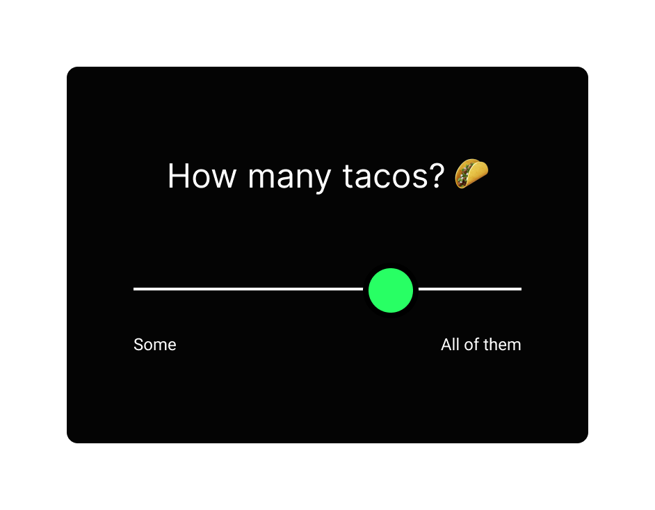
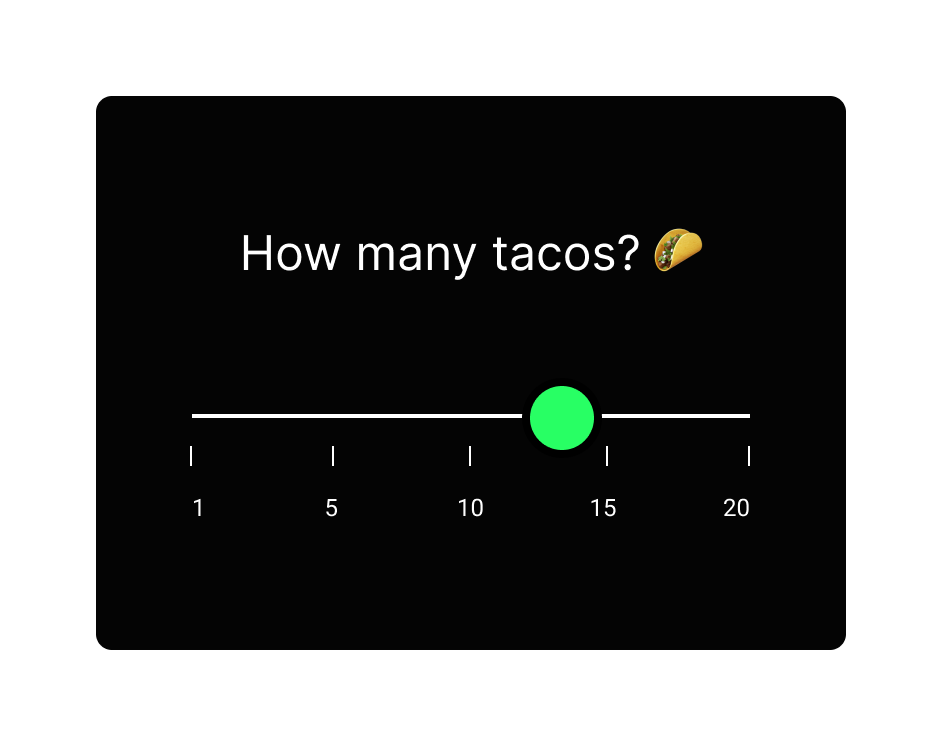
If we tried to use this same slider on a control that does require precision, like how many tacos you want to buy, it would fail. More precision would be required to get to the desired amount since a vague result would be undesirable. But who doesn’t love tacos?
Improving precision
Can we fix it? There are a few approaches for adding precision to sliders.
- Add labels or ticks marks. The physical sound board example includes a visual scale next to the slider track to help the user target a specific setting. This is slightly better but still not precise.
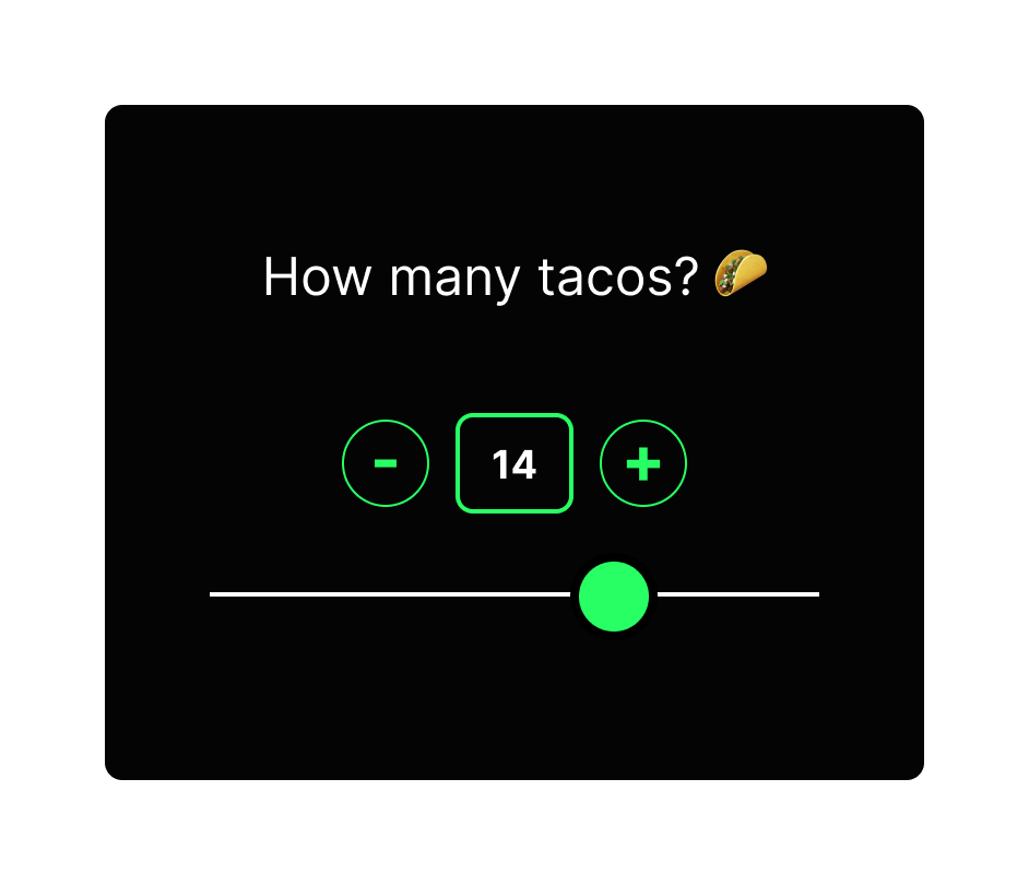
- Add a precise control onto the slider. A text input next to the slider would let the user input their exact number desired. The trade off is we’ve made the interface more complex. Is this combination now better than just a text input alone? Maybe not.
- Instead of an open range that lets you select any value between the ends of the range, we can set defined steps. 1, 5, 10, 15, 20. This removes some flexibility by limiting the options available, but it benefits from adding precision and confidence for the user. Make sure the use case supports the limited options. For example, the user couldn’t choose 12 in this case. With this trade off, is the slider more functional than other inputs like a dropdown menu of preset options? Probably not.
Each of these modifications has a trade-off for complexity or flexibility. In the volume case, simplicity was the priority, not precision. Examine what’s most important for your use case and test it with humans. Next time you order tacos, or shoes, or anything you pay for, check out the UI. Simple, common inputs abound, because they are precise and easy to understand.
Speaking from experience
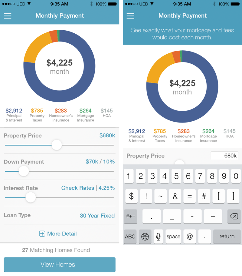
My opinion on sliders comes from being there myself. I designed a mobile app for my previous employer with multiple sliders back in 2014. The design goal was to make a calculator more playful. It aimed to promote exploration and discovery, instead of precision. We wanted users to play with the sliders to discover how each factor impacted the calculated mortgage results. With this goal, sliders provided a friendly way to adjust the inputs. Knowing the limitations of sliders, we counter-balanced the sliding input with text inputs mode. These two modes allowed us to keep the playful control as default to promote discovery while still providing an option for precise control when needed.
Disclaimer: I’ve learned a lot since this project so looking back at it the design flaws are glaring. Wish I could fix things like the color contrast issues, but it was a fun project and a great learning experience.
Accessibility
I can’t talk about UI without preaching accessibility. Sliders are often designed for touch or mouse input without any regard for keyboard control, which is critical for many users and assistive tech. Providing clear buttons on either end of the slider is a simple way (but not the only way) to improve accessibility support and reduce cognitive load for your users. Another key measure is coding the slider with proper Aria properties (see reference links).
Conclusion
Your take-away from this slider example is this: special isn’t always better. When you brainstorm design ideas you can think big, sketch creative ideas, and add visually interesting or trendy components. As you refine, don’t fall in love with your own ideas because they wont all be good ones. Always test and validate your design choices to make sure they are founded on good user experience fundamentals.
- Don’t use a special control that ends up making the experience less usable.
- Don’t use a slider because they add visual interest or feel unique in your interface.
- Make sure it will improve usability over standard inputs like a text box or dropdown
- Make sure its built for accessibility and tested with real humans
- Design for function before form and then test with users to validate your choices.
- Functional design is beautiful.