UI Traps - Disabled Buttons and Inputs
15 Jun 2023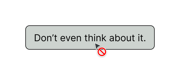
User & System
User Experience/User Interface design is about making a system (device/application) as usable for the user (human, customer) as possible. User is in the name! So why do we often forget that part? We end up designing for the system instead, to the harm of the user.
We speak for the humans using the machines, not the other way around.
A foundational principle of UX is to give the user control. Giving users control over their experience will build a sense of ownership, empowerment, and happiness about the application. Disabled UI (buttons, inputs, controls) breaks this principle of user control. They display an element the user cannot control, often without any explanation as to why.
Common example
Use an input form as an example. If an application requires the user to fill in all required inputs, designers and engineers often jump to the conclusion that the submit button should be disabled until the required inputs are completed. The logic is that this will prevent incorrect submissions of the form. Notice in this case the system is now defining the rules for the user. The system has removed an aspect of control. The user has to adjust their behavior to satisfy the system’s requirements.
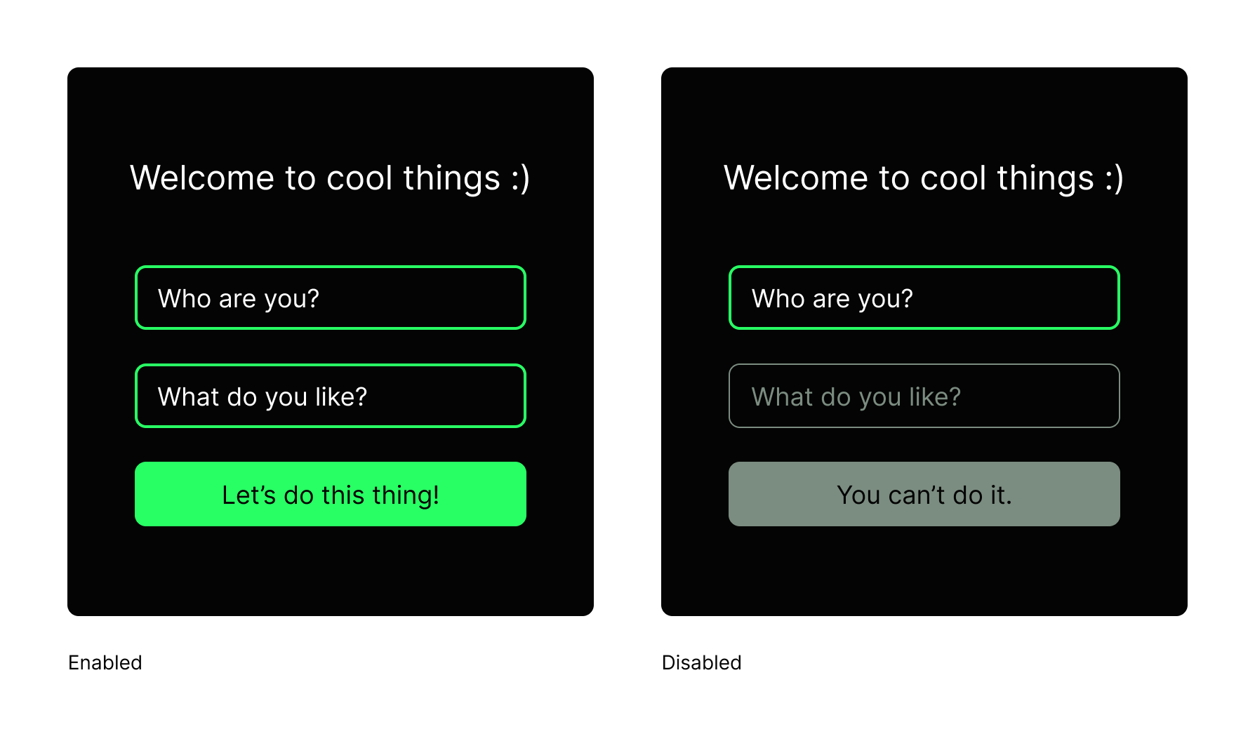
Disabled form example
Users first, not system first
What if we thought about this from the user first? Instead of disabling an input because the system doesn’t like it, we could allow the user to keep control in this form example.
Instead of optimizing to prevent incomplete submissions, we could allow that submit button to be tapped anytime (instead of disabling it). Won’t the errors continue? Yes, but the way we respond to those errors can be much more user-friendly. Simple messages can guide the customer toward success, like filling in required fields in this case. Design your experience to instruct the user instead of blocking them.
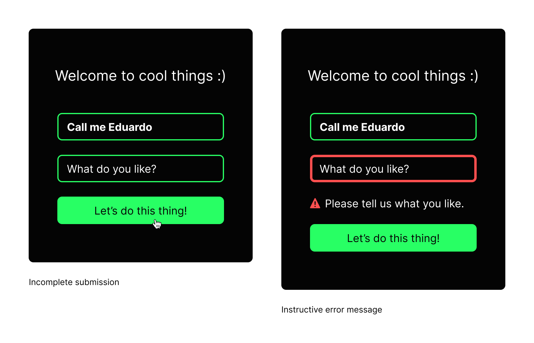
Instructive messages improve the user experience
Hidden actions
Would it be better to hide a control than show it as disabled? In some cases, this can be a good solution. By default, the control is hidden, but once the user has met a certain condition, then the control is revealed. For example, if a list of items has controls, like a delete button, is not available to a user, it’s hidden. This way there is no confusion if the item can be deleted or not.
Accessibility
In addition to the usability already discussed, there can be accessibility concerns with disabled controls. Visually, disabled buttons are often designed to be grey, at lower contrast than active buttons. Although the WCAG (Web Content Accessibility Guidelines) standard provides an allowable exception for this low contrast, I argue the practice is breaking the intent, making the interface less usable. Our goal should be to make things easy to distinguish, clear to comprehend and functional for anyone. In contrast, disabled elements intentionally exclude many users.
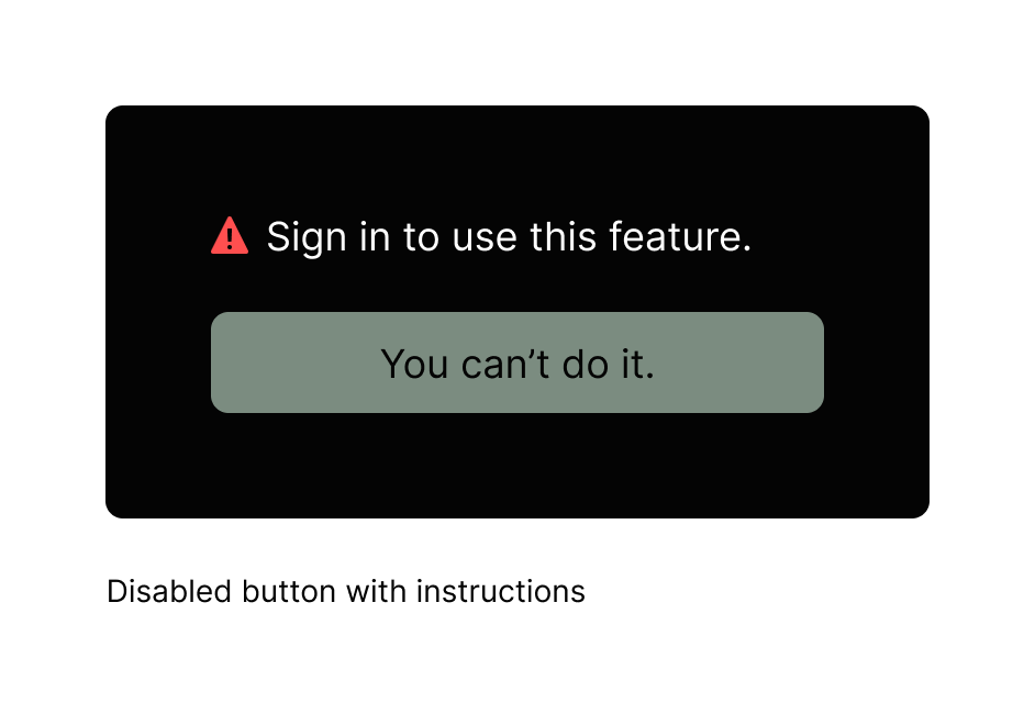
Last resort: add a message to explain.
If you have tried everything to change the product requirements and argue for accessibility but disabled buttons still can’t be prevented, find a new job. Or at least provide a message as an explanation to the user so they are not guessing why a button is broken.
Do the right thing
Together we can improve the industry standards. Instead of pointing to big name competitor’s poor decisions and calling them best practices, think through your designs and look out for manipulative design practices at your company. Just because company X did it, doesn’t mean you should follow. Set yourself as an example of ethical design by avoiding design traps like disabled buttons and inputs. The customers wont notice or thank you because good design is often invisible. Do it because we know it’s the right thing to do and it will set an example for others in your company to learn from.